My girlfriend's favorite word is no. Not stubbornly. Just whenever I ask where she wants to go tonight. Any restaurant I suggest. Any decision that requires committing to something. So I built Roll Date Dice: a date night selector calibrated to what we actually like. You roll. You go.
The feeling I was designing for was an easy yes.
I keep starting somewhere before the pixels. With a moment in ordinary life, a feeling that's either missing or broken, and then a question I can't quite shake: what would an interface have to do to produce it?
What if the relationship was different entirely
Most software has a power dynamic nobody talks about. The computer asks things of you. It notifies you, demands your attention, interrupts you to say something went wrong.
praiseOS inverts this. Every action you take, the OS notices it. You opened a file: well done. You finished something: the computer is glad.
The premise question that made it worth building wasn't "how do we make this more usable." It was: what if the relationship between the person and the machine was different entirely? That question came before any interaction, any visual, any spec. The interface can't answer a question you haven't asked yet.
Who is actually there
I've started naming who is actually there before designing anything. Not the action. The person.
Someone saving a file just finished three weeks of work. Someone in onboarding decided to try something new and doesn't know yet if it was the right call. Someone staring at an error message just had their momentum broken. Someone who missed a streak is already being hard on themselves. Someone who failed the same form field three times is confused, not careless. They need a different explanation, not the same error again.
The interface designed for the task is functional. The interface designed for the person is felt.
The Vault came from this. I kept building to-do lists and abandoning them. Task frame: someone managing priorities. Felt frame: someone who needs consequence, not another system that requires willpower. So the list stakes real money. Miss a task and you lose it. The friction is the design.
The gap between the trees
Crown shyness is what botanists call the gap trees leave between each other. Their canopies almost touch in the sky but never quite do. A natural distance that breathes.
I looked at my inbox. Everything was jammed together. So I breathed the same gap into it. Each thread floats with its own space. It sounds like a small thing. It felt like a different inbox entirely.
Once I have the feeling I want, I go looking for where it already exists. Not as metaphor. As material. The physical world has already solved the problem of producing feelings. I'm borrowing something that works.
You want completion to feel like rest: think about putting down a heavy bag, pushing a plate slightly away after a meal. The weight releases. Nothing immediately demands the next thing. You want a destructive action to carry real weight: a door closing in an old building, the pause just before a point of no return. Find those moments. They're your raw material.
Nature spent a long time getting this right
The same is true for colour. Every palette that feels right in digital already exists somewhere in the physical world. Sunset at 6pm in October. Wet stone. Water at different depths.
Natural Gradients is a palette system built from observation. The software grid starts from theory. The physical world starts from experience. There's something in that gap I keep returning to.
How something arrives changes how it lands
The physical world doesn't just have better colors and spaces. It has better ways for things to arrive.
What if your notifications grew like flowers?
Not because it's cute. Because the way a thing arrives shapes what it feels like to receive. A notification that erupts is not neutral. A notification that blooms is not neutral. The choice between them carries real emotional weight that most products hand to framework defaults without thinking.
Every timing curve, every spring constant, every duration between action and feedback shapes what something feels like. The iOS spring is not a neutral choice. 200ms is not a neutral choice. Each one produces a felt quality that either aligns with what you're trying to make or quietly contradicts it. Own these decisions. They're aesthetic decisions with real consequences.
A letter waits
I have friends in six different time zones. A notification reaches them. A letter waits for them.
Love Letters is a digital letter you write to someone scattered. It takes longer to compose than a message. It's designed to be opened slowly. The medium changes what receiving feels like.
I turned this whole practice into a Claude Code skill. It reviews and builds interfaces through one lens: does this feel like it was made by a human who cared about how you would feel using it?
View on GitHubInstall: npx skills add mariespreitzer/interfaces-that-feel
Party to the People
My master's thesis asked one question: what if listening to music alone could feel like being on a dance floor?
I spent months interviewing people about specific moments. The stranger you dance near without speaking. Heartbeats syncing with the bass. The second you look up and the whole room is feeling the same thing. These moments have specific behaviors: presence without interruption, synchrony without announcement, proximity without exchange. I was looking for the digital equivalent.
Six prototypes came out of it. Presence Pulse. Song Reactions. Heartbeat Sync. Music Soulmate. Digital Dancefloor. And a sixth that can't be named, because Spotify took it on for internal development. Each started not from a feature but from a specific felt moment. Exhibited as interactive prototypes in 2024.
Read the thesisDesigning for the full human
If an interface only works for someone who is fine, it was designed for an ideal user who doesn't exist.
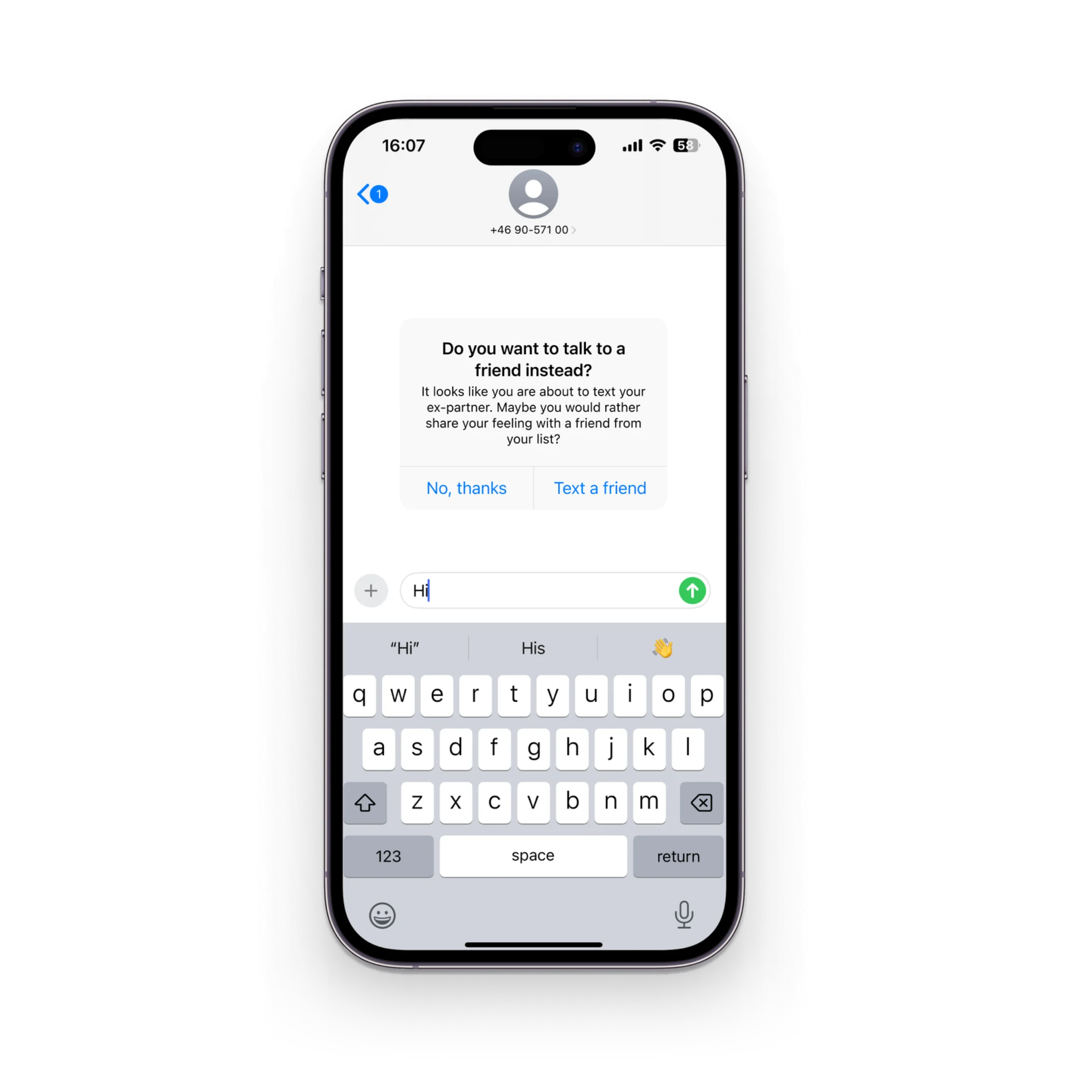
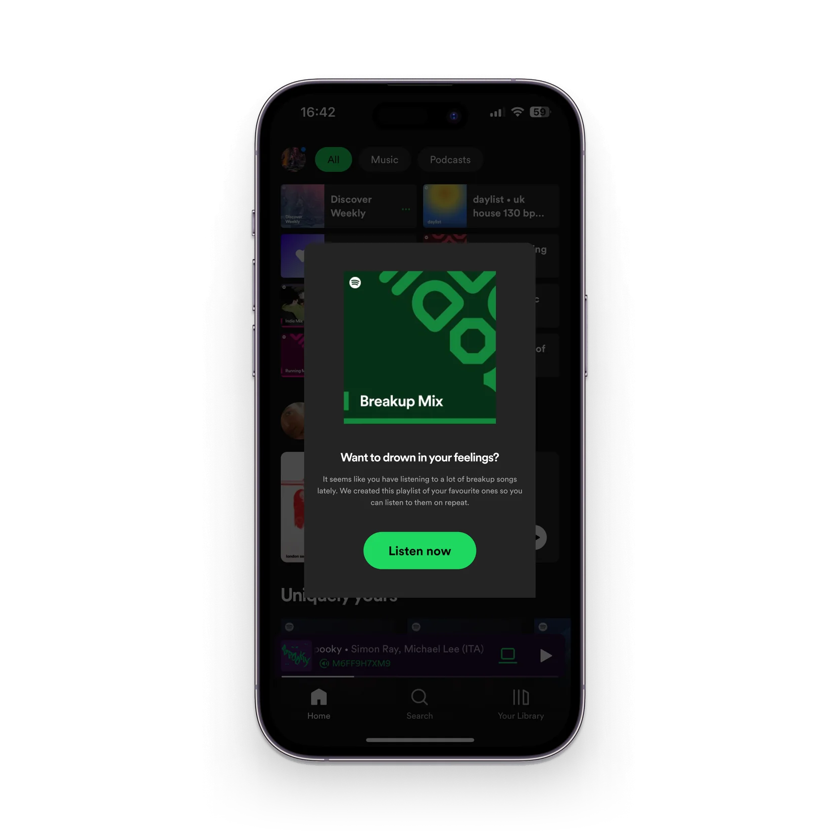
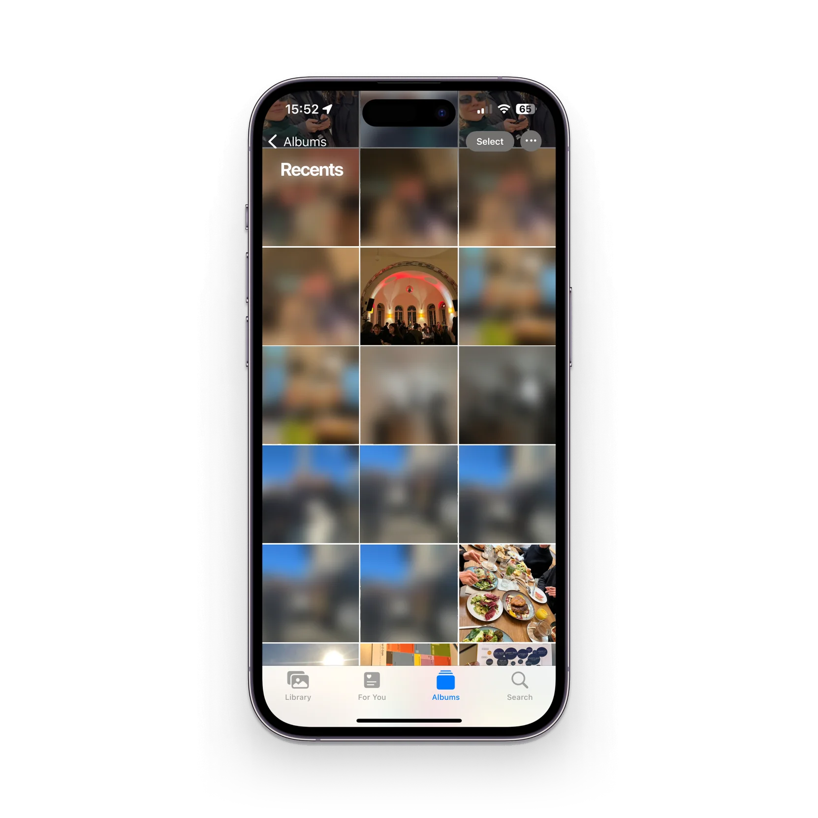
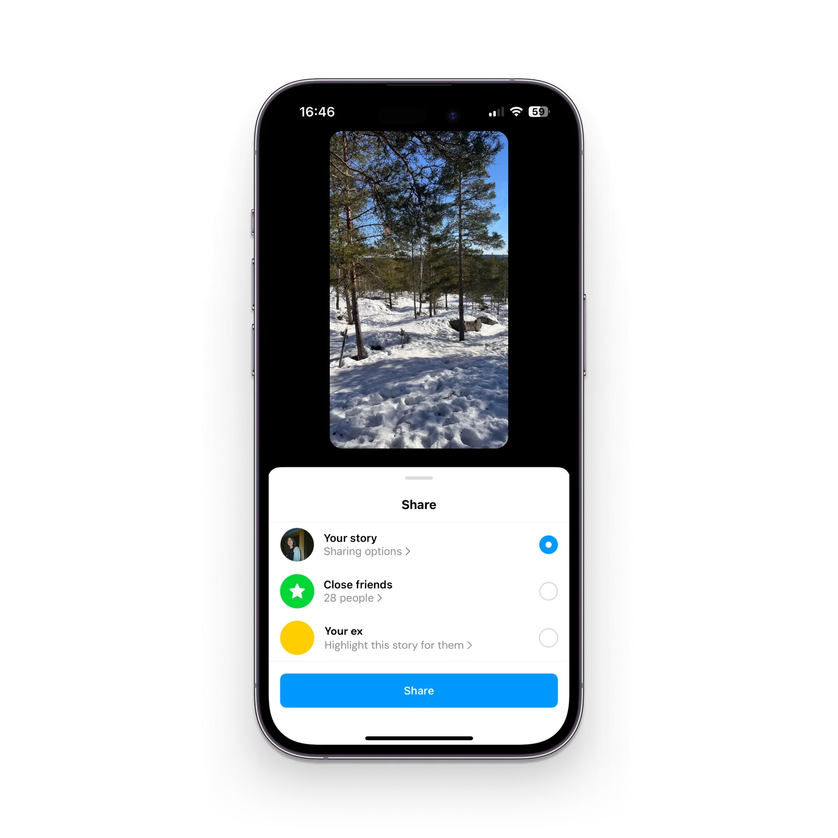
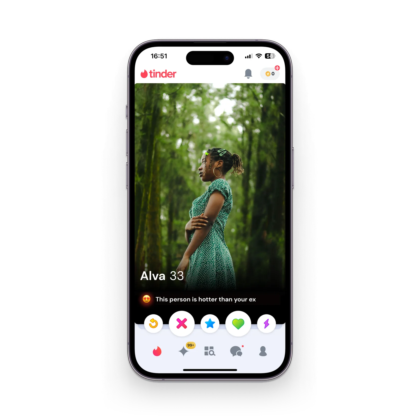
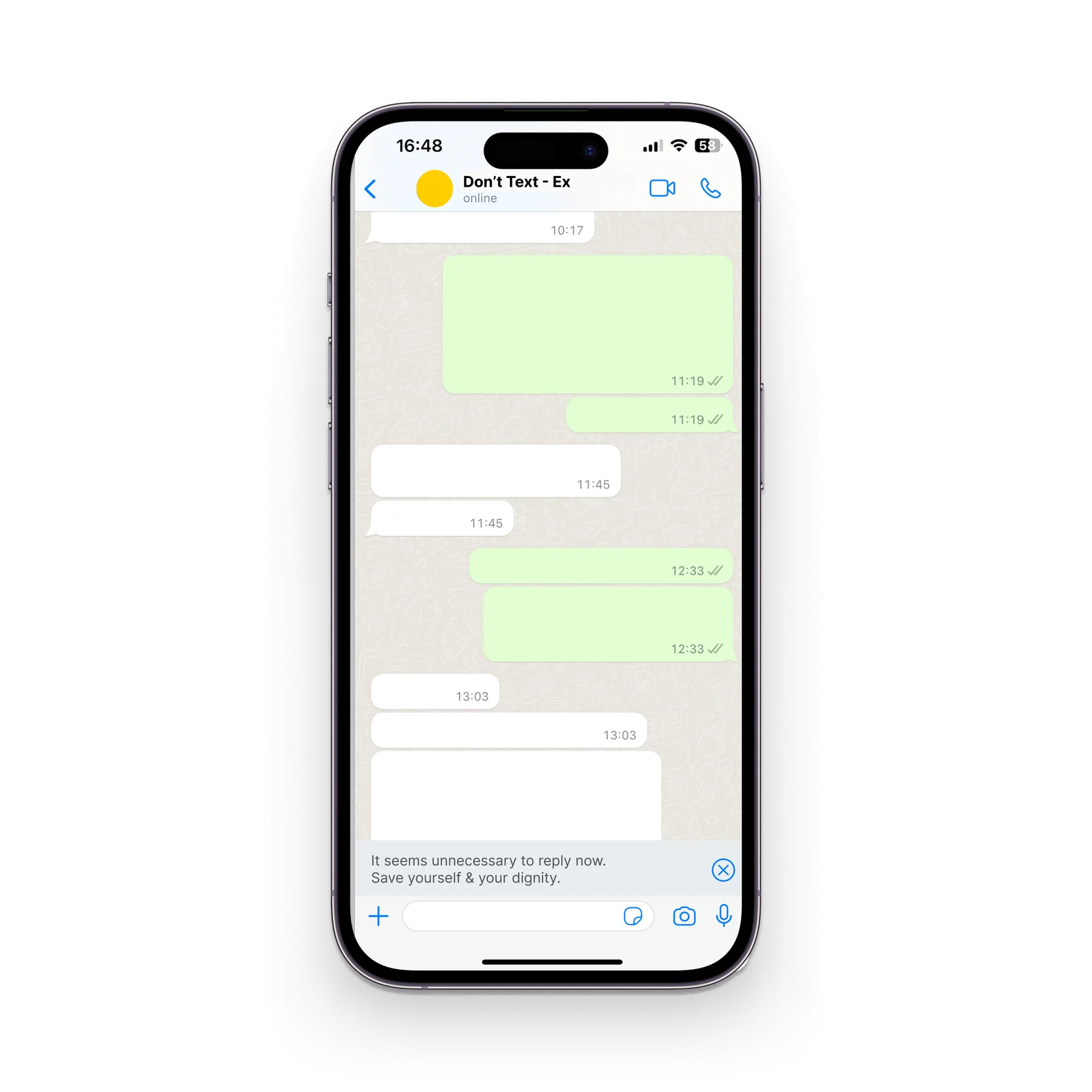
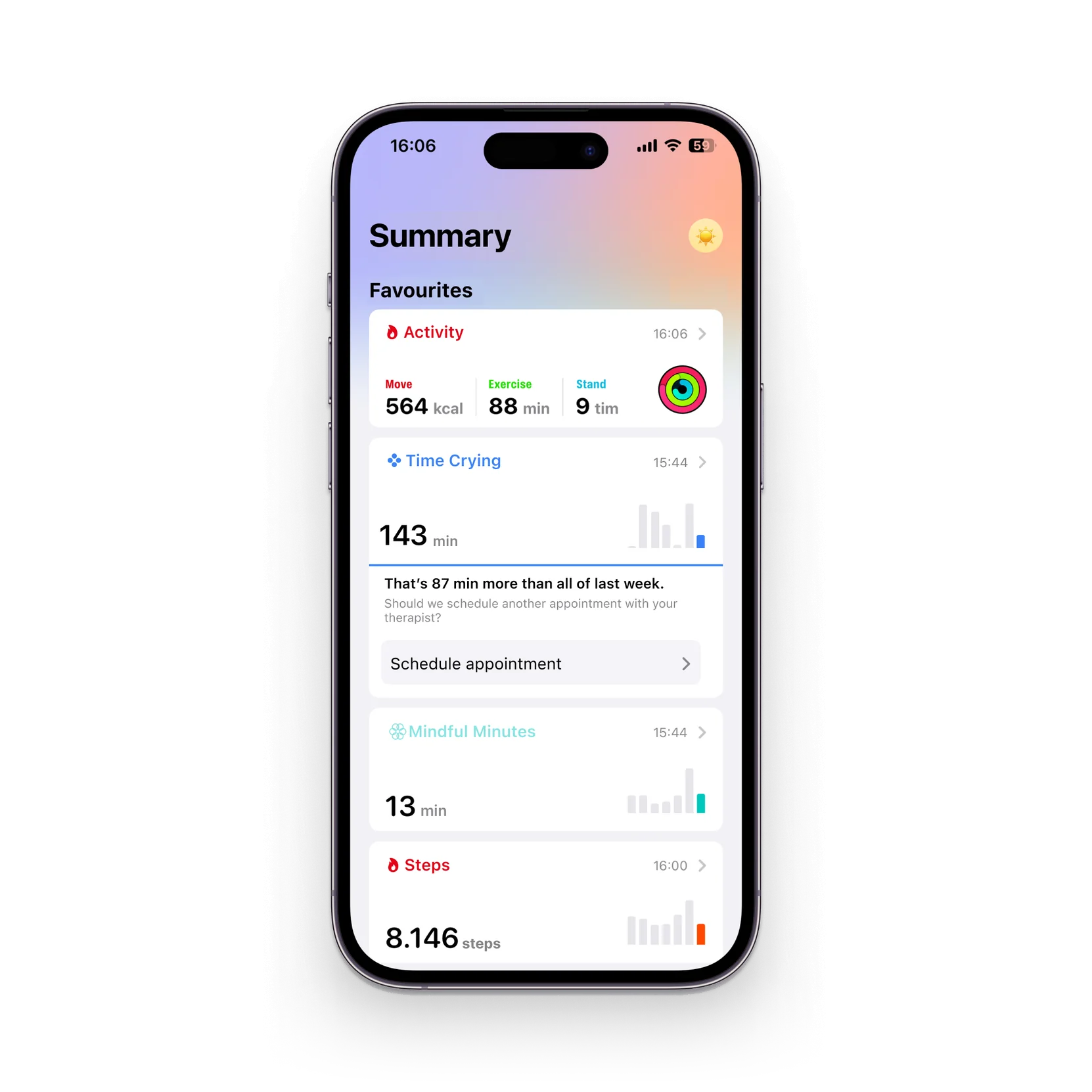
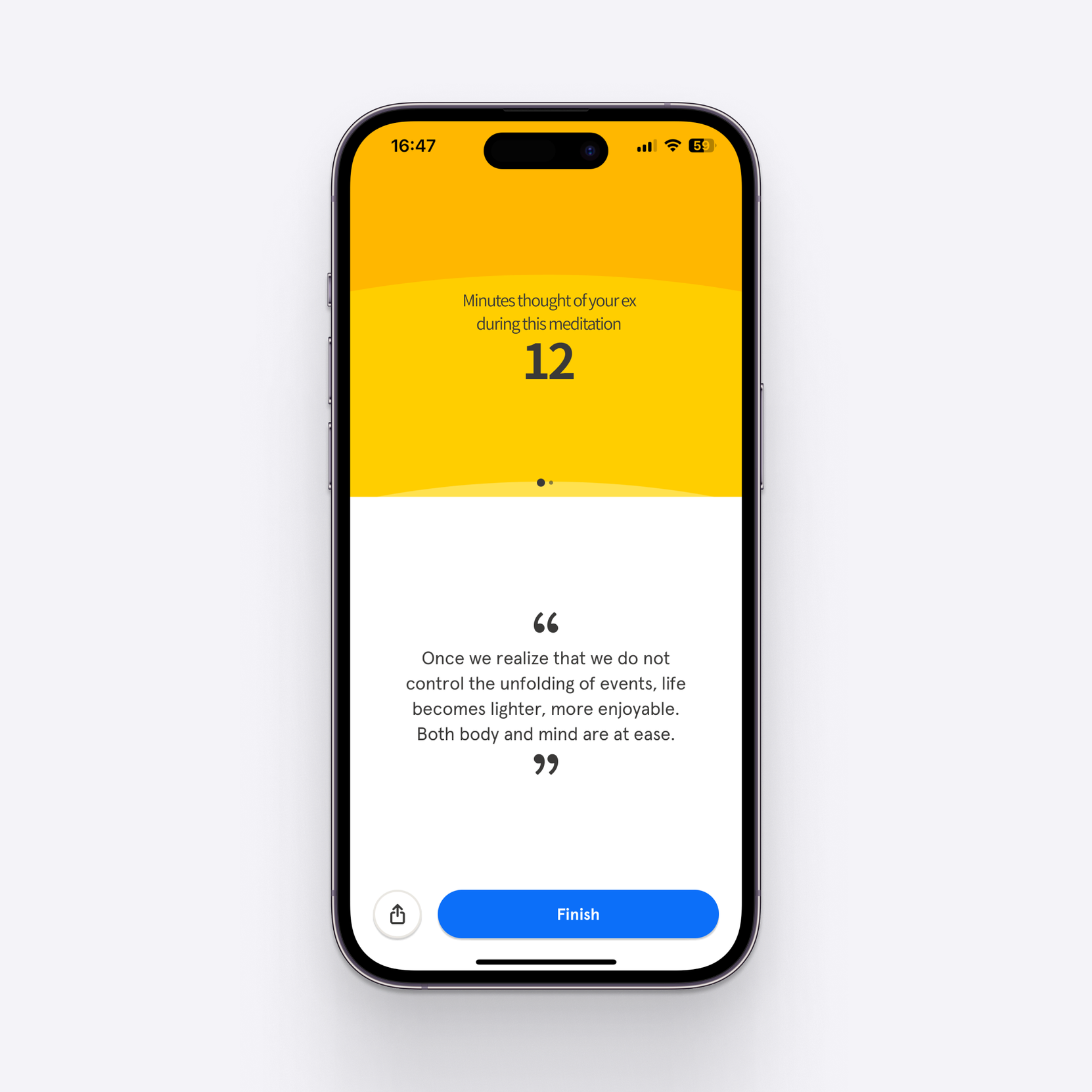
An alert that stops you texting someone you shouldn't. A photo grid that hides but never erases. A playlist that knows which songs belong to which person. A dating app that reminds you something better is out there.
These aren't edge cases. They are the design brief for anyone who takes the full human seriously.