Two teams who never spoke to each other, building a product that had to work in a room with a client.
Problem statement
The client used data analytics to win business: showing potential buyers where risks were rising, which programmes would help, how much they'd save. The data was strong. The problem was that the sales team couldn't explain it and the data team didn't know what the sales team needed to say. They were rarely in the same meeting. The tool they were pitching with was a static deck.

My role
I owned the design end to end: chart library, collaborative annotation layer, and an opening experience designed to frame what the tool was for before any data loaded. One frontend engineer handled the build; three data engineers managed data fetching and the environment setup within Accenture's infrastructure. The design brief was effectively mine to define: the client hadn't separated sales needs from data needs before, so there was no existing spec to follow.
Process
Narrative architecture
I started by sitting with each team separately: the data team explaining what the models could show, the sales team explaining what they needed to say in a room with a client. They rarely met together. Most of the work was narrative architecture: translating between two domains without ever having both in the same room at once. I anchored on the sales side. What could a salesperson actually say in a meeting? What did they need the data to prove? I worked backwards from those questions into what the interface had to show.
Restructuring mid-project
The direction changed significantly mid-project. We started with a narrative about one individual moving through their healthcare journey, which was relatable but too narrow. I took that feedback and restructured around it: existing clients would see their own real numbers, prospective clients a representative book of business. That shift changed how the story was structured, how the charts were annotated, and where users could dive deeper or skip entirely depending on who was in the room.
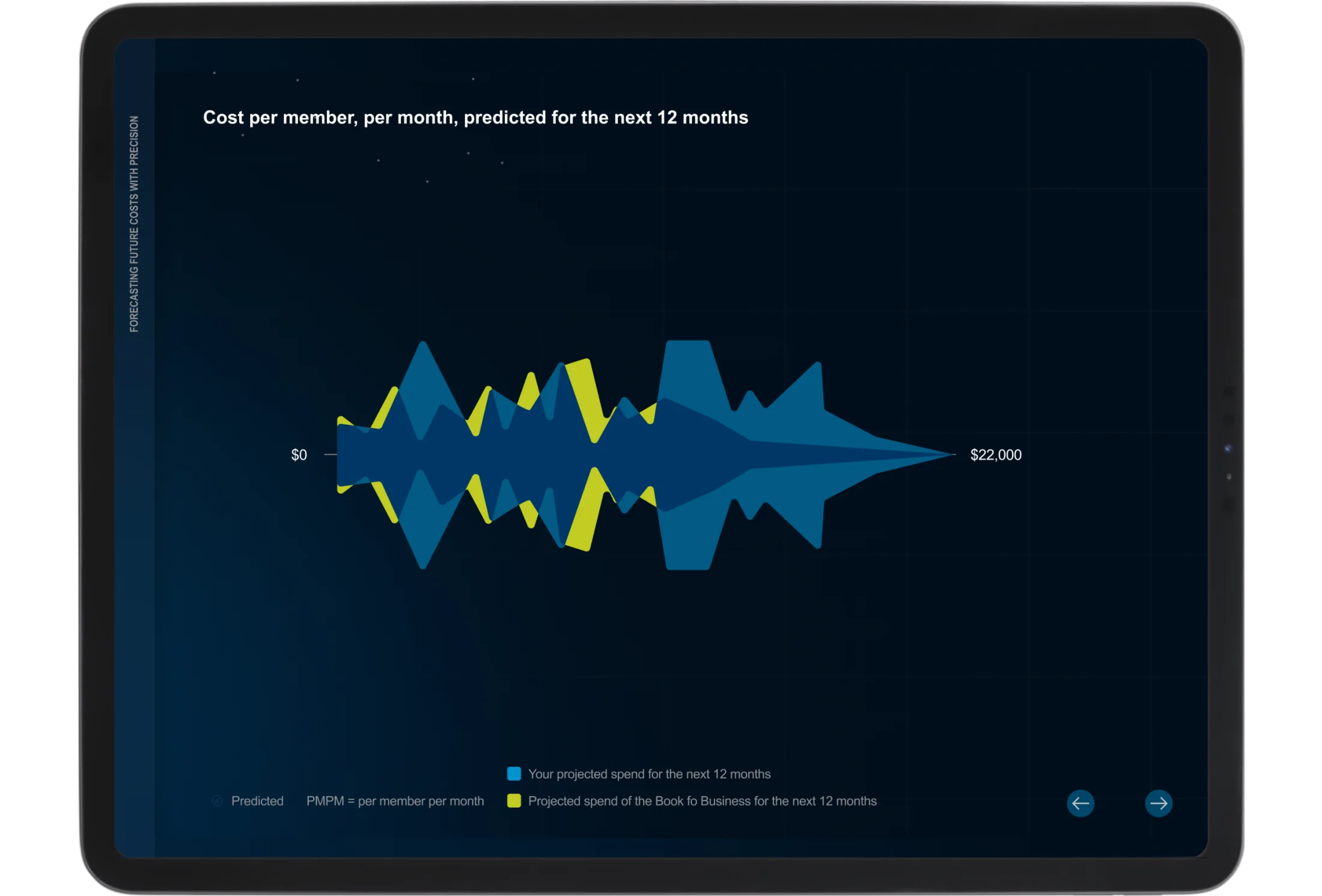
I tested with the sales team throughout. They were one of the two audiences I was designing for, and what they could and couldn't use in a meeting shaped every decision.
The SDoH chart
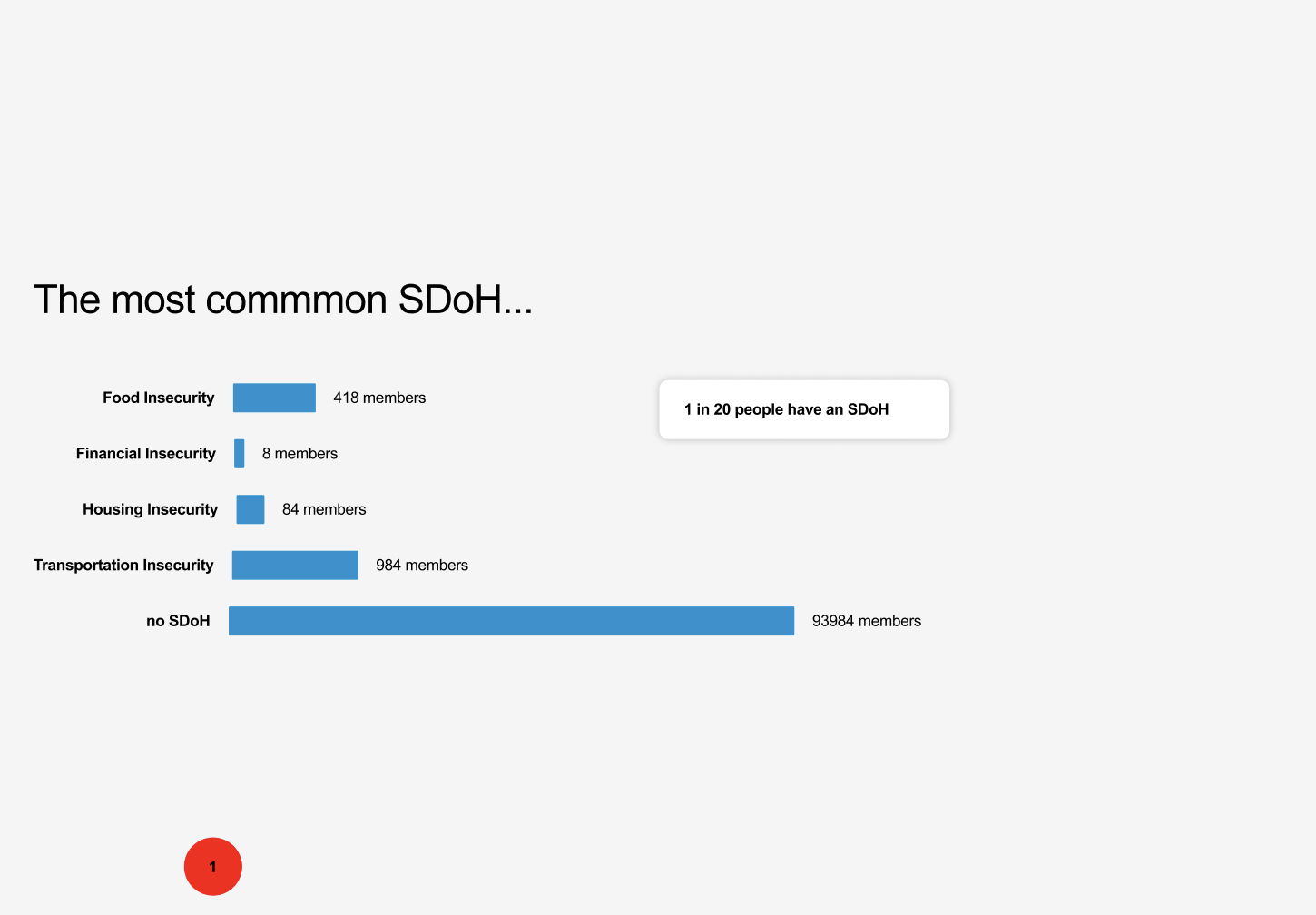
The SDoH chart went through more than a dozen versions. Early cuts were simple: a bar chart of the most common factors, S-curves mapping risk escalation by category. Clear, but they didn't show the relationship between conditions and social factors. We tried stacking more in: area charts layering member counts and cost, trellis grids with every condition and SDoH factor labelled. A diamond correlation matrix showed all of it at once. The data team could read it. No salesperson could have narrated it in a room. We landed on a sunburst: filterable by condition, each SDoH factor as a ring, the key risk level readable at a glance. The constraint that shaped the final choice was whether someone could say it out loud.
Outcome
The tool is actively in use. The team was flown to the US to present it to new stakeholders. A second round has been requested.
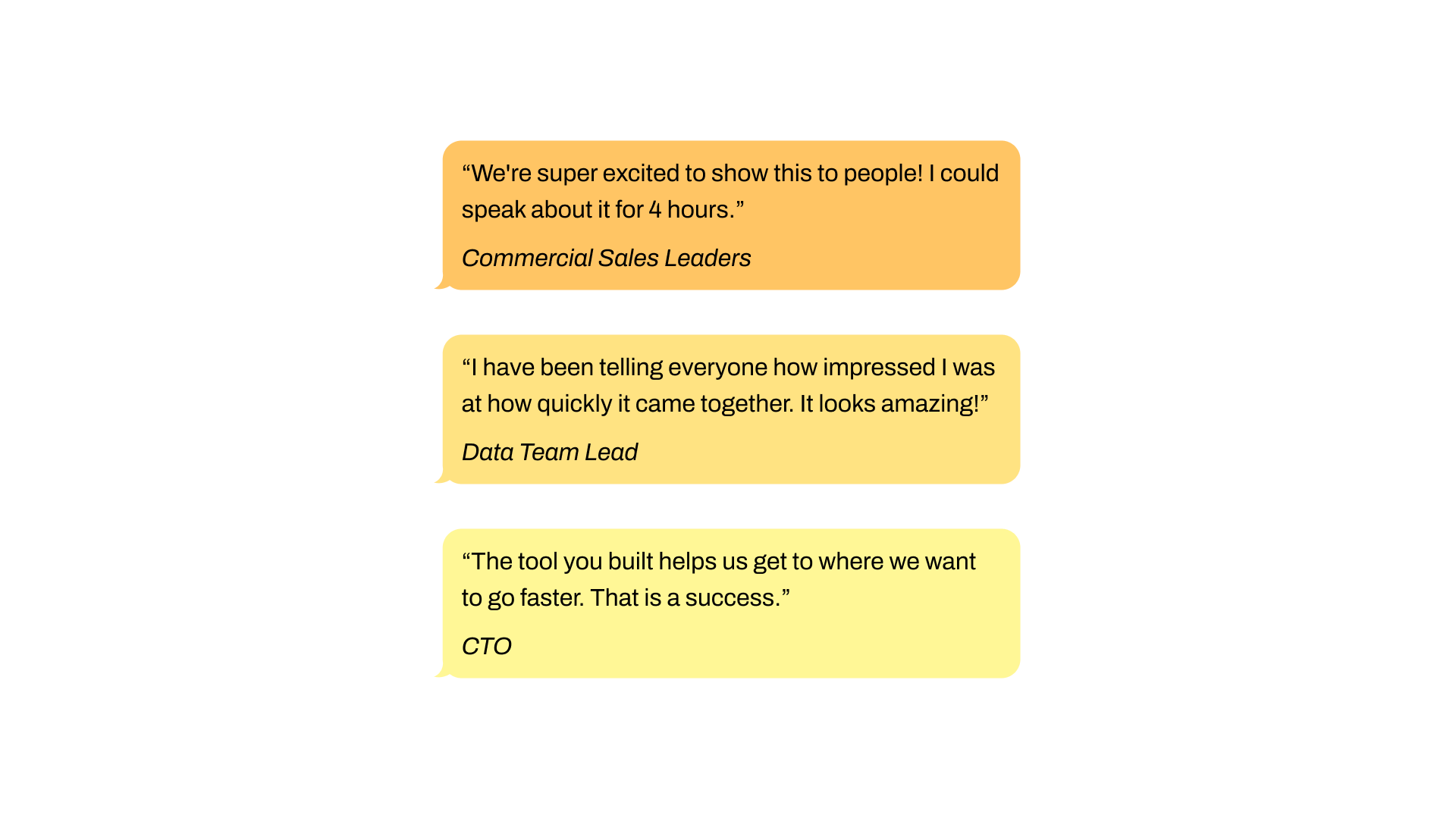
The Commercial Sales Leaders said they could speak about it for four hours. The Data Team Lead told everyone how quickly it came together. The CTO said it helped them get to where they wanted to go faster.